Auto-Generating Daily WeChat Covers with MiniMax: A Production Pipeline Postmortem
Auto-Generating Daily WeChat Covers with MiniMax: A Production Pipeline Postmortem
Our WeChat newsletter "Coder's Breakfast" ships a tech-news digest every morning at 8. The content side has been fully automated for months, but the cover image remained the weak link: either an operator hunted for a picture by hand, or an SVG template spat out an information card — tidy, but flat, with zero click appeal in a subscription feed.
This week we automated the cover too: MiniMax generates the background, code composites the headline, zero manual steps. This post is the full postmortem of the pipeline, with all three generations of real output below — not concept mockups, but images produced on the same day from the same top news item.
1. Start with the Two Hard Constraints
Before writing any code, we ruled out the shortest path — "just ask the AI for a finished cover with the title on it" — because it hits two walls that no amount of prompting can fix:
Wall one: AI-rendered CJK text is always garbled. This is a limitation of current text-to-image models, not a prompt-engineering problem. And the single most important element of a news cover is its Chinese headline — if the title is mush, the cover is dead.
Wall two: the aspect ratios don't match. WeChat headline covers require 2.35:1 (a little-known spec — upload 16:9 and it gets cropped), while the widest ratio MiniMax image-01 supports is 21:9, roughly 2.33:1.
Both constraints point to the same architecture, summed up in one sentence: AI owns the mood, code owns the information.
MiniMax renders a 21:9 marketing-style background (prompt bans all text)
    ↓
sharp center-crops to exactly 2.35:1 (940×400)
    ↓
SVG text layer composited on top: gradient scrim + brand badge + headline
    ↓
Upload to Tencent COS → Playwright pushes it into the WeChat draft
The headline is drawn as SVG, so it is always razor-sharp, never garbled, and automatically tracks each day's top story.
2. First Attempt: One Adjective Shoved the Subject Out of Frame
Our first background prompt included generous negative space — anyone who has done design work knows white space reads as premium. The result:

The entire subject got crammed into one side, leaving 60% of the frame as flat empty color. On a square canvas, negative space is composition; on a 21:9 banner, it is a disaster — the model interprets "negative space" as "pile everything into one corner."
Worse, there's a WeChat-specific gotcha: when an article is shared into a chat, the thumbnail is a 1:1 square cropped from the center of the cover. With the image above, readers would see a patch of plain orange — the subject cropped out entirely.
The fix was simple: delete every white-space adjective and give explicit compositional orders instead:
main subject centered in the middle of the frame,
symmetric balanced composition filling the full width
One retry, fixed:

3. Version 2 Still Wasn't Enough: Pretty, but Not Marketing
Version 2 solved the composition, but dropped into a subscription feed it still fell short: a gentle flat illustration with no title. A reader scanning the feed has no idea what today's issue is about. A cover's job is to sell the click, not to decorate.
The final version changed two things.
The background went marketing-grade. The prompt moved from "cream-colored flat illustration" to "dark tech poster": deep dark backdrop, glowing orange light streaks, dramatic rim lighting — plus an explicit main visual subject placed on the right half, left half darker and clean, reserving the left side for text.
A text layer went on top. A 940×400 transparent SVG carries a left-to-right darkening gradient (scrim), then the brand badge, the date, the day's headline in large bold type, and a bottom slogan. Even if the background drifts on a given day, the scrim guarantees headline contrast — readability is never left to the model's mood.
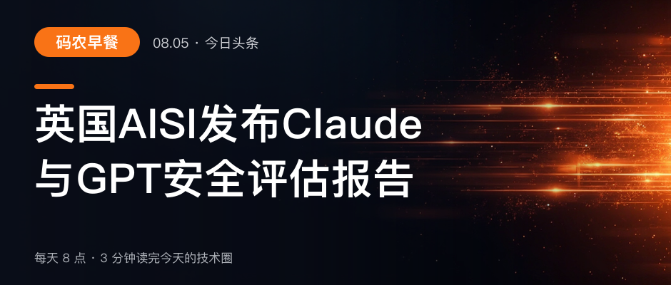
Put the three images side by side and you're looking at one pipeline evolving across three iterations: illustration → centered → marketing. The code diff behind that evolution is tiny: one prompt constant and one SVG template function.
4. The Text Layer Has More Typography Rules Than You'd Think
"Draw text on an image" sounds trivial. In practice every rule below turned out to be mandatory:
- Never split a Latin word. Our first line-breaker cut at the character midpoint and sliced "Claude" into "Clau / de". The fix: tokenize first — an ASCII word is an atomic unit, CJK breaks per character, and line breaks only happen at token boundaries.
- Weight the visual width. A Latin character is roughly half as wide as a CJK character. "OpenAI 发布 GPT-5.6" is 17 characters by count but only about 12 CJK-widths visually. Font auto-sizing must use visual width, or Latin-heavy titles render comically small.
- Pull leading punctuation up. If a line break leaves the second line starting with a comma or period (a typographic taboo in CJK), move that mark to the end of the first line.
- Two lines max. Overlong titles get truncated with an ellipsis; a third line is never allowed.
One more local-dev gotcha: emoji inside SVG (our badge originally had a ☕) render as solid-color silhouettes under librsvg. Don't fight it — just don't use emoji.
5. Engineering Guardrails: What Happens When Image Generation Fails
This pipeline runs unattended on a daily cron, so no single step may become a point of failure:
- MiniMax hides business errors inside HTTP 200. Rate limiting (1002), auth failure (1004), insufficient balance (1008), and content-safety blocks (1026) all return status 200, with the real code in
base_resp.status_code. Checking only the HTTP status is the same as having no error handling. - Only rate limits deserve retries. 1002 gets a 2s/5s backoff; retrying auth, balance, or content-safety errors ten thousand times yields the same answer, so those throw immediately.
- A failed image never breaks the pipeline. Any exception falls back to the old SVG template cover. A plain cover for one day is acceptable; a missed daily issue is not.
6. Bonus Find: The WeChat Editor Auto-Rehosts External Images
Pushing the cover into the WeChat draft produced an unexpected win. Conventional wisdom says "WeChat article images must live on WeChat's media library," and we assumed we'd have to reverse-engineer the upload API. Turns out we didn't:
Paste HTML containing an external <img> into the editor, and WeChat's frontend automatically rehosts the image onto its own CDN — measured at about 4 seconds per image, transitioning through mmbiz.qlogo.cn and hardening into a permanent mmbiz.qpic.cn URL after save.
The one trap: saving the draft before the rehost finishes silently drops the image. So the automation polls every <img> src in the body and only clicks save once they've all flipped to WeChat domains.
Takeaways
Three lessons from this pipeline earned their keep:
- Layer the work; never make AI do what it's bad at. Mood goes to the image model, information goes to code. Headlines, brand marks, dates — anything that must be exact — never touches the model.
- Wide-format prompts need compositional orders, not aesthetic adjectives. "Negative space" balloons into half a frame of emptiness at 21:9; "subject centered, filling the full width" is what behaves deterministically.
- Unattended pipelines need a fallback at every stage. AI APIs are inherently flaky; survive with backoff plus graceful degradation, not hope.
Every morning now, the distance from "what's today's top story" to "a marketing-grade, headline-bearing cover sitting in the WeChat draft box" contains zero manual steps. That's what content operations should look like in the AI era: humans set the style, machines run it.